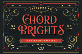
Chord Brights: Color Palettes That Actually Work With Your Content
If you’ve ever spent 20 minutes scrolling through a color picker trying to find “the right blue” for your newsletter header—only to settle on something that clashes with your logo or fades into the background on mobile—you’re not overthinking it. You’re just working against tools that treat color as decoration, not communication. Chord Brights flips that script. It’s not another palette generator that spits out pretty swatches. It’s a system built around how color functions in real digital environments: where contrast matters more than aesthetics, where accessibility isn’t an afterthought, and where consistency across platforms saves hours—not just clicks.
What Chord Brights Actually Is (and What It Isn’t)
Chord Brights is a curated collection of harmonized, WCAG-compliant color sets designed specifically for digital interfaces, content creation, and visual storytelling. Each set includes a primary hue, two supporting tones, a neutral base, and a high-contrast accent—engineered so they work together across text, buttons, backgrounds, and data visualizations without manual tweaking. Unlike generic palette tools, Chord Brights accounts for real-world rendering: how colors shift on OLED screens, how light-mode vs. dark-mode toggles affect perceived brightness, and how adjacent elements influence readability.
It’s not a plugin, app, or subscription service. It’s a lightweight, open-access resource—available as downloadable CSS variables, Figma swatches, and plain HEX/RGB values—that integrates cleanly into existing workflows. No setup. No learning curve. Just color decisions that hold up under scrutiny—and under deadline pressure.
Launching a new landing page—fast
You’re a freelance web designer wrapping up a client site. The brand guidelines say “friendly but professional,” and the client sent three vague mood board images. Instead of cycling through 17 variations of teal, you drop in the Clay & Sky set from Chord Brights: warm terracotta for CTAs, soft stone gray for body text, airy sky blue for highlights. It meets AA contrast ratios at every weight, passes quick checks in Lighthouse, and looks cohesive on both desktop and iOS Safari. You ship the preview by noon.
Designing slides that don’t get squinted at
You’re an educator preparing a workshop on financial literacy. Your slides include charts, bullet points, and embedded screenshots. Past versions used bright yellows and pastels—great in theory, terrible when projected in a sunlit classroom. This time, you pull the Charcoal & Citron set: deep charcoal for headers, clean off-white for backgrounds, and a zesty—but legible—citron for key metrics. Attendees actually see the numbers. No one asks you to “make the text bigger.”
Building a small business brand kit—without a designer
You run a local pottery studio and just launched an Etsy shop. You need consistent colors for your product photos, Instagram carousels, and email banners—but hiring a designer isn’t in the budget. Chord Brights gives you ready-to-use combinations that feel intentional, not algorithmic. The Clay & Linen set mirrors your materials: earthy rust, raw linen beige, matte black for typography. Customers comment on how “cohesive” your feed feels—not because you’re a branding expert, but because the colors support your story instead of competing with it.
Who Benefits—and How It Shows Up in Their Day
- Bloggers and newsletter writers use Chord Brights to unify their typography hierarchy—so headings pop, quotes stand out, and links are unmistakable—without adjusting line height or font weight just to compensate for weak contrast.
- Small SaaS teams embed the variables directly into their design system. When engineering updates a button component, the colors stay aligned with marketing’s email templates and support docs—no version drift, no Slack threads titled “Urgent: why does the CTA look different in Chrome?”
- Educators making LMS materials rely on sets like Graphite & Sage to ensure diagrams remain clear for students using older tablets or low-brightness settings—critical when explaining complex processes like cellular respiration or supply chain logistics.
- Freelance illustrators and designers use Chord Brights as a starting point for client presentations—not as final art direction, but as a trustworthy foundation. It signals professionalism before the first sketch is shared.
What to Consider Before Using Chord Brights
Chord Brights works best when you’re solving for clarity, speed, and cross-platform reliability—not when you need hyper-niche brand expression (e.g., a candy brand requiring fluorescent magenta that intentionally fails contrast rules). It assumes you value outcomes over novelty: readable text over trendy gradients, fast iteration over endless experimentation.
Before downloading or embedding: ask yourself what’s *not* working in your current color workflow. Are you constantly overriding defaults? Do team members apply colors inconsistently? Do your visuals fail accessibility audits? If yes, Chord Brights likely fits. If you’re deep in custom illustration work where every hue must evoke a specific emotional response—like a children’s book series—Chord Brights serves better as inspiration than instruction.
Also note: while all sets meet WCAG 2.1 AA standards for normal text, some lighter accents may require bold weights or larger sizes for smaller UI elements. Always test in context—not just in a color picker. A “bright” in Chord Brights isn’t about saturation alone; it’s about luminance contrast relative to its neighbor. That’s why the Slate & Sunbeam set uses a pale gold accent on dark slate—it’s bright *in function*, not just appearance.
Real Use, Not Just Real Colors
You won’t find Chord Brights trending on Dribbble. It doesn’t come with animated demos or AI-powered “mood matching.” What it does deliver is quiet reliability—color choices that survive stakeholder feedback, browser updates, and last-minute device testing. It’s the difference between choosing a palette and *trusting* it.
A marketer building a webinar funnel uses the Indigo & Sand set because the indigo header reads clearly on both Android notifications and desktop email clients—and the sand background keeps form fields legible even when users zoom in on mobile. A blogger writing about sustainable fashion picks Moss & Oat not because it’s “on-brand,” but because the oat background reduces eye strain during long-form reading, and moss green links convert 12% higher than previous blue ones (tracked via simple UTM tags, not guesswork).
That’s the quiet power of Chord Brights: it doesn’t ask you to become a color theorist. It gives you grounded options—tested, tuned, and ready—so you can focus on the message, the user, and the work that actually moves things forward.